Revisiting The Office: A text analysis
I’m casually rewatching The Office as my I need something uninvolved to half-occupy my brain for 20 minutes show. Its been almost seven years since the last episode aired, but I still quote it with my closest friends and family – such was its personal and cultural significance. It’s aged like high school: I look back with fondness at the familiar jokes, but there’s also a sense that it was a time we have outgrown. I believe showrunner Mike Schur (also, Dwight’s cousin Mose) has gone on to write far more artistically significant shows.
Exploring the scripts
Recently the schrute package was released, containing scripts of every episode of The Office. I decided to dig into the text. I started by cleaning up the data a little, producing the following data frame. In the following analyses, I explore some patterns in the data that might (or might not) comport with the average viewer’s memory or perception of the show.
## # A tibble: 55,130 x 3
##    speech character text
##     <int> <chr>     <chr>
##  1      1 Michael   All right Jim. Your quarterlies look very good. How are thi…
##  2      2 Jim       Oh, I told you. I couldn't close it. So...
##  3      3 Michael   So you've come to the master for guidance? Is this what you…
##  4      4 Jim       Actually, you called me in here, but yeah.
##  5      5 Michael   All right. Well, let me show you how it's done.
##  6      6 Michael   Yes, I'd like to speak to your office manager, please. Yes,…
##  7      7 Michael   I've, uh, I've been at Dunder Mifflin for 12 years, the las…
##  8      8 Pam       Well. I don't know.
##  9      9 Michael   If you think she's cute now, you should have seen her a cou…
## 10     10 Pam       What?
## # … with 55,120 more rows
Speaking time
The simplest analysis is to evaluate how much each character speaks. To keep it from getting too cluttered, I filtered the data to a smaller subset of characters to show some trends over time. The following code computes the percentage of an episode’s dialogue each character spoke, and visualizes them with trend lines.
# Unnest words
words <- df %>%
    group_by(season_episode) %>%
    unnest_tokens(word, text) %>%
    anti_join(stop_words, by = "word")

# Get main characters to plot
chars <- c("Michael", "Dwight", "Jim",
           "Pam", "Andy", "Erin",
           "Ryan", "Holly")

# Count proportion of words by each character in an episode
speakers <- words %>%
    group_by(season_episode) %>%
    mutate(total_words = n()) %>%
    group_by(season_episode, season, episode,
             episode_name, character, total_words) %>%
    summarise(words = n()) %>%
    ungroup() %>%
    mutate(prop_words = words / total_words,
           id = as.numeric(as.factor(season_episode)))

# IDs of new seasons
new <- tibble(new = c(7, 29, 52, 66, 92, 116, 140, 164))

# Plot
speakers %>%
    filter(character %in% chars) %>%
    mutate(character = factor(character, levels = chars)) %>%
    filter(!(character == "Michael" & season == 9)) %>%
    ggplot(aes(x = id, y = prop_words)) +
    geom_vline(data = new, aes(xintercept = new),
               linetype = "dashed", color = "grey") +
    geom_point(aes(color = character), alpha = .1) +
    stat_smooth(aes(group = character, color = character),
                se = FALSE) +
    geom_vline(xintercept = 136) +
    geom_label(x = 136, y = .5, label = "Goodbye\nMichael") +
    scale_color_viridis_d() +
    theme_minimal() +
    scale_x_discrete(labels = NULL) +
    theme(legend.position= "bottom") +
    labs(title = "Main speakers in The Office",
         subtitle = "Proportion of words by characters over time",
         x = "Season & episode", y = "Proportion of words",
         color = NULL)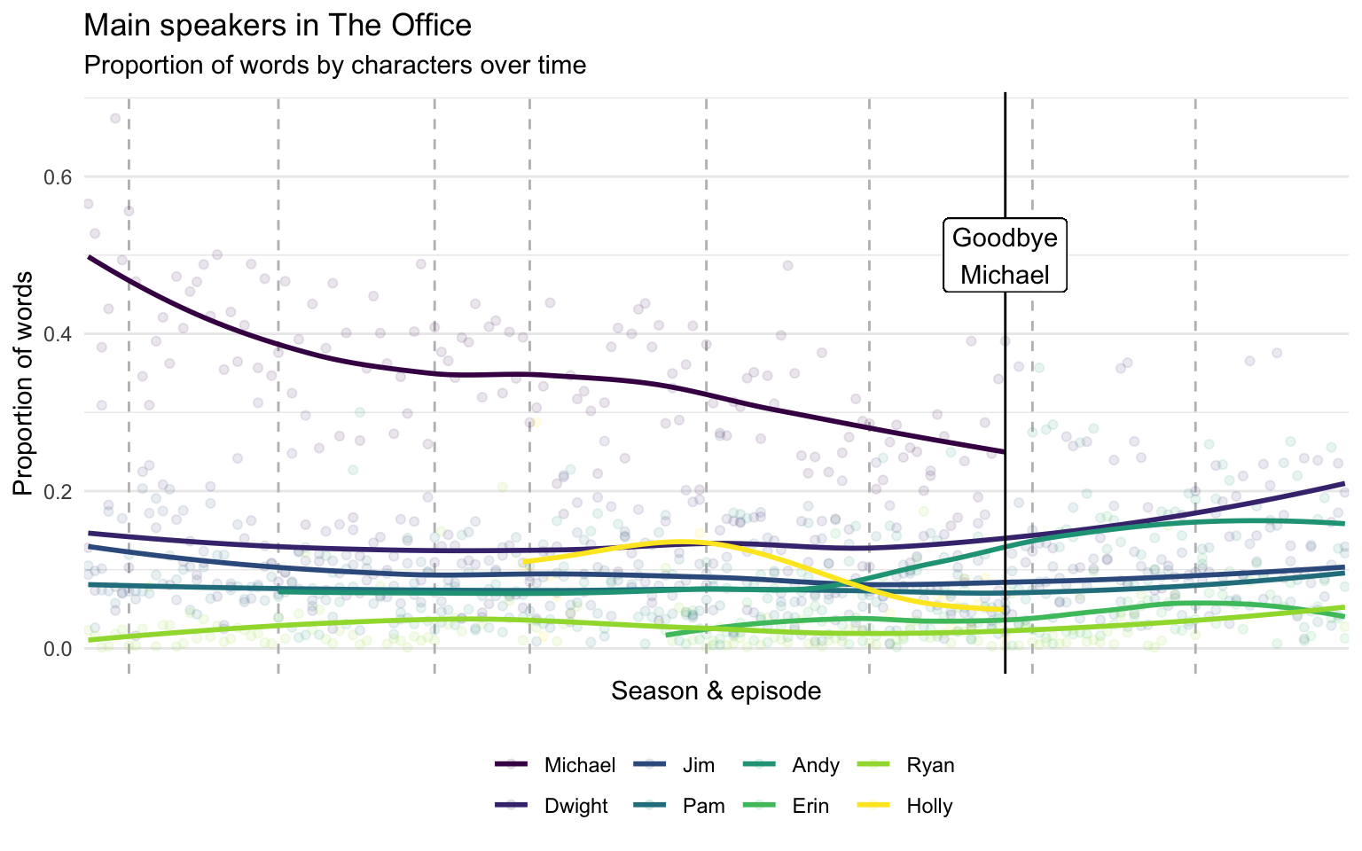
Michael Scott obviously has the most dialogue, but it seems other characters took a larger chunk of the dialogue over time up to when Michael left in season seven.1 After Michael left, Dwight and Andy got bumps in their speaking time. Jim, Pam, and Ryan have steady amounts of dialogue throughout, but Jim and Pam are obviously tied together and play bigger parts. Additionally, Holly had significant dialogue for a short stretch, but tapered off in a way that suggests she was written in to allow Michael’s exit from the show. So far, there are no surprises.
Name-calling
My first thought was to look at the interactions between characters (e.g., which characters share screen-time together), but the schrute dataset doesn’t have an indicator for scenes. I did the next best thing I could think of: analyze when characters called other characters by name. This is an obviously limited view – people often speak to or about others without mentioning anyone by name – but all things being equal this might still reveal patterns of relationships. The following plot visualizes the number of times each character (the speaker) uses the name of another character (the referent).2
# Characters to include
chars <- c("Michael", "Dwight", "Jim", "Pam",
           "Andy", "Erin", "Ryan", "Kelly",
           "Jan", "Toby", "Darryl", "Stanley",
           "Phyllis", "Meredith", "Creed",
           "Angela", "Oscar", "Kevin", "Karen")

# Unnest words
refs <- df %>%
    filter(character %in% chars) %>%
    group_by(character) %>%
    unnest_tokens(word, text) %>%
    anti_join(stop_words, by = "word") %>%
    mutate(word = ifelse(word == "mike", "michael", word)) %>%
    filter(word %in% tolower(chars)) %>%
    count(character, word) %>%
    mutate(word = str_to_sentence(word)) %>%
    arrange(character, -n) %>%
    ungroup()

# Plot
refs %>%
    mutate(word = factor(word, levels = chars),
           character = factor(character, level = rev(chars))) %>%
    ggplot(aes(x = word, y = character)) +
    geom_raster(aes(fill = n)) +
    scale_fill_viridis_c(trans = "log",
                         breaks = c(2, 10, 50, 100, 200),
                         labels = c(2, 10, 50, 100, 200)) +
    theme_minimal() +
    theme(panel.grid = element_blank(),
          axis.text.x = element_text(angle = 90, vjust = .6)) +
    labs(title = "Name-calling in The Office",
         subtitle = "Number of mentions by lead characters",
         caption = "Note: Color represents\nlog-transformed mentions",
         x = "Referent", y = "Speaker", fill = "Mentions")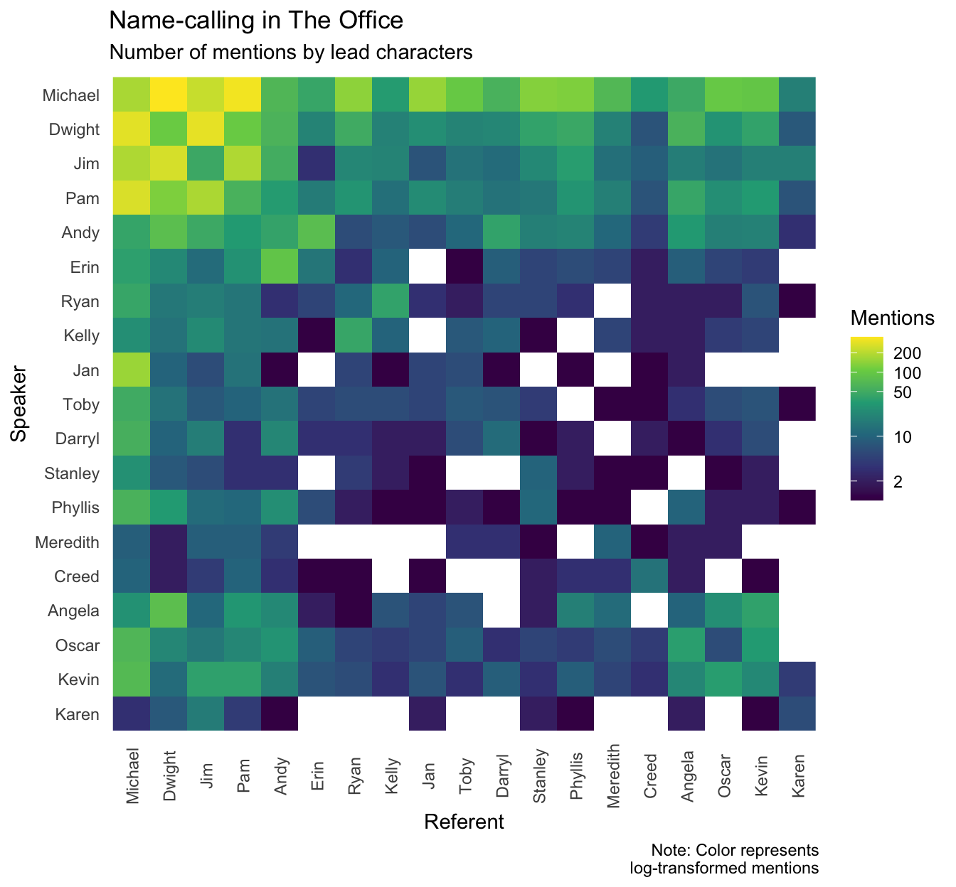
A few interesting observations (many of which will likely confirm the impression viewers have):
- The main characters – Michael, Dwight, Jim, and Pam – frequently reference each other, but generally reference others more than average (probably a function of having more dialogue in general).
- Romantically-paired characters (Ryan & Kelly, Dwight & Angela, Andy & Erin) tend to mention each other more than average.
- Some clusters of characters who interact frequently (e.g., the accountants) also mention each other more than average.
- It’s also an interesting way of seeing which characters had little overlap, and never mentioned each other.
Office feelings
One more simple thing I thought to analyze was the sentiment of each character’s dialogue. The tidytext library contains a sentiment corpus by Finn Årup Nielsen that rates 2,476 words on a scale from -5 (very negative) to +5 (very positive). To look at the overall positivity/negativity of each character’s speech, I plotted the distribution of words by sentiment, with the characters ordered from most positive to most negative on average.3
# Characters to include
chars <- c("Michael", "Dwight", "Jim", "Pam",
           "Andy", "Erin", "Ryan", "Kelly",
           "Jan", "Toby", "Darryl", "Stanley",
           "Phyllis", "Meredith", "Creed",
           "Angela", "Oscar", "Kevin", "Karen")

# Unnest words
tmp <- df %>%
    filter(character %in% chars) %>%
    unnest_tokens(word, text) %>%
    anti_join(stop_words, by = "word") %>%
    inner_join(get_sentiments("afinn")) %>%
    rename(score = value)

# Plot words by sentiment
tmp %>%
    group_by(character) %>%
    mutate(M = mean(score)) %>%
    ggplot(aes(x = score, y = fct_reorder(character, M),
               fill = character)) +
    geom_density_ridges(stat = "binline", binwidth = 1) +
    scale_fill_viridis_d(guide = "none") +
    scale_x_continuous(breaks = seq(-5, 5, by = 1),
                       minor_breaks = seq(-5, 5, by = 1),
                       limits = c(-5, 5)) +
    theme_minimal() +
    labs(y = "Speaker", x = "Sentiment",
         title = "Sentiment in The Office",
         subtitle = "Distribution of sentiment in
         words spoken by main characters")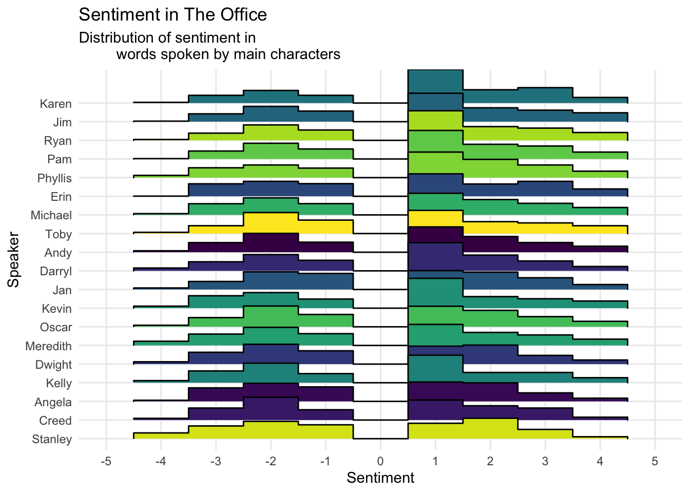
Most characters have pretty similar profiles, except for Stanley, whose speech contains way more extremely negative words and very few extremely positive words. He says “damn” (sentiment score of -4) 11 times, which is pretty frequent considering he’s a secondary character.
My wife suggested an interesting analysis: What sentiment do characters have when speaking about other characters? This combines the sentiment analysis with the name-calling analysis above. To do this, I picked out utterances by each character that referenced other characters, and calculated the total sentiment of words in that utterance (e.g., when Michael mentions Dwight by name, he often insults him as well, using words with negative sentiment). The following plot visualizes the average sentiment of speech made by each character (the speaker) when referring about another character (the referent), with the size of the points representing the number of utterances (I only included combinations with ≥ 10 utterances).
# Unnest words
# Michael is sometimes referred to as Mike
tmp <- df %>%
    group_by(season, episode) %>%
    unnest_tokens(word, text, drop = FALSE) %>%
    anti_join(stop_words, by = "word") %>%
    mutate(word = ifelse(word == "mike", "michael", word))

# Get utterances that contain names
tmp <- tmp %>%
    filter(word %in% tolower(chars)) %>%
    unique() %>%
    rename(referent = "word") %>%
    mutate(referent = str_to_sentence(referent)) %>%
    unnest_tokens(word, text, drop = FALSE)

# Get sentiment towards referents
sentiment <- tmp %>%
    inner_join(get_sentiments("afinn")) %>%
    rename(score = value) %>%
    filter(character %in% chars) %>%
    group_by(id, season, episode, text, character, referent) %>%
    summarise(sentiment = sum(score))

# Plot
sentiment %>%
    group_by(character, referent) %>%
    summarise(utterances = n(),
              sen = mean(sentiment)) %>%
    ungroup() %>%
    mutate(character = factor(character, level = rev(chars)),
           referent = factor(referent, level = chars)) %>%
    filter(utterances >= 10) %>%
    ggplot(aes(x = referent, y = character)) +
    geom_point(aes(size = utterances, color = sen), alpha = .8) +
    scale_color_viridis_c() +
    scale_x_discrete(drop = FALSE) +
    scale_y_discrete(drop = FALSE) +
    theme_minimal() +
    theme(axis.text.x = element_text(angle = 90, vjust = .6)) +
    scale_size_continuous(range = c(2, 10), breaks = c(10, 50, 100)) +
    labs(x = "Referent", y = "Speaker",
         color = "Average\nsentiment", size = "Utterances",
         title = "Feelings for Office co-workers",
         caption = "Note: Speaker-referent\npairs with ≥ 10 utterances",
         subtitle = "Average sentiment of utterances about others")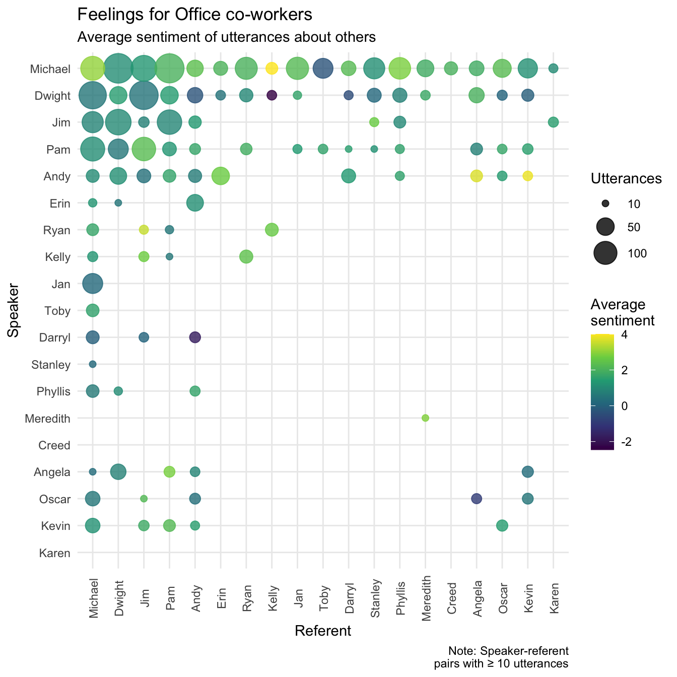
From this, most characters seem to have pretty average speech when referring to other characters, although from my knowledge of the show, this is probably because characters alternate between saying positive and negative things towards others (rather than consistently using neutral words). The main points of interest are speaker-referent combinations with exceptionally positive speech (e.g. Ryan to Jim, Michael to Kelly, Andy to Kevin), which reminds me that a weakness of this kind of simple sentiment analysis is that it doesn’t detect sarcasm. Speaker-referent pairs with extremely negative speech make more apparent sense to viewers: Dwight to Kelly, Oscar to Angela, and of course, Michael to Toby.
We can get a simpler view of this analysis by collapsing the utterances across speakers, and simply show for each character as a referent, the sentiment of speech about them from all speakers.
# Plot
sentiment %>%
    group_by(referent) %>%
    mutate(M = mean(sentiment)) %>%
    ggplot(aes(x = sentiment, y = fct_reorder(referent, M),
               fill = referent)) +
    geom_density_ridges() +
    geom_vline(xintercept = 0, linetype = "dashed") +
    scale_fill_viridis_d(guide = FALSE) +
    scale_x_continuous(breaks = seq(-10, 15, by = 5),
                       minor_breaks = seq(-10, 16, by = 1),
                       limits = c(-10, 16)) +
    theme_minimal() +
    labs(y = "Referent", x = "Sentiment",
         title = "The Office favorites",
         subtitle = "Average sentiments of
         utterances involving main characters")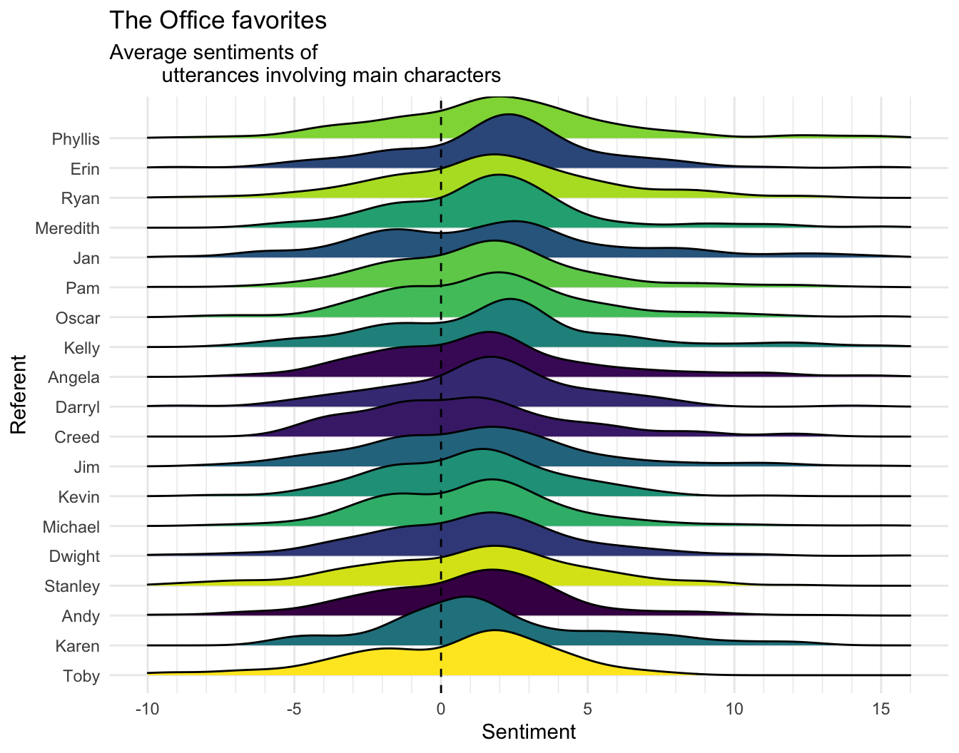
Note who is at the bottom. Oh Toby, why are you the way that you are?
It’s pretty widely acknowledged that the show’s quality declined over time, and I do find later seasons (without Michael) to be kind of a slog. But one indicator of this I’ve realized in rewatching The Office is that most of the most quotable lines are heavily concentrated in the first couple of seasons! The writers peaked early with the memorable dialogue.↩
Since only a few character-referent combinations had a high number of mentions, I visualized log(mentions), to allow greater discriminability between values in the lower end of the scale.↩
The majority of each character’s words are not contained in the corpus, and can be considered “neutral” (a rating of zero).↩