#TidyTuesday: Meteorite landings
#TidyTuesday is a weekly data project for R users to practice data wrangling and visualization skills. Users work on a new dataset released each Tuesday, and then share their work.
This week’s edition (Tidy Tuesday 24) is a dataset of meteorite landings from NASA. It’s a pretty hectic week for me, so I decided to make a single visualization.
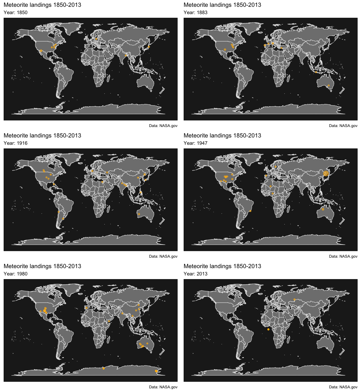
The dataset consists of location data for each meteorite found up until 2013. I wanted to create a visualization that would capture both the geographical and temporal information, so I made an interactive map using the gganimate package. Each point represents the location of a meteorite in a given year, and the size of each point represents the relative mass of the meteorite.1
# Plot map
p <- ggplot(data = df) +
    geom_polygon(data = world, aes(x = long, y = lat, group = group),
                 fill = "grey50", color = "grey90", size = .3) +
    geom_point(aes(x = long, y = lat, size = mass),
               alpha = .6, color = "darkgoldenrod1") +
    scale_color_discrete(name = "Type") +
    scale_size_continuous(guide = FALSE) +
    theme_map() +
    theme(panel.background = element_rect(fill = "grey12"),
          panel.border = element_blank(),
          panel.grid.major = element_blank(),
          panel.grid.minor = element_blank()) +
    labs(title = "Meteorite landings 1850-2013",
         subtitle = "Year: {round(frame_time)}",
         caption = "Data: NASA.gov") +
    transition_time(year) +
    enter_fade() +
    exit_shrink() +
    ease_aes("sine-in-out")

# Create animation
animate(p, fps = 4, height = 500, width = 690, res = 150)
I filtered the dataset to include only meteorites found from 1850. In years prior to that, there are very few meteorites in the dataset – this implies that the observation of meteorites was less sensitive back then (as it’s unlikely that meteorites have truly gotten more common over time).↩