#TidyTuesday: Ramen ratings
#TidyTuesday is a weekly data project for R users to practice data wrangling and visualization skills. Users work on a new dataset released each Tuesday, and then share their work.
This week’s edition (Tidy Tuesday 23) contains ratings of ramen from The Ramen Rater. For health reasons, I’m currently unable to eat most ingredients found in this delicacy, so this analysis is the closest I’ll come to ramen for now.
Exploring the data
The dataset contains a list of ramen products, including the brand, name, style, country, and rating (in stars from 0 to 5). To start with, I’ll plot the ratings of all ramen products by style in histograms, with lines indicating the median ratings.
# Get median ratings
median <- ramen %>%
    drop_na(stars, style) %>%
    group_by(style) %>%
    summarise(Mdn = median(stars))

# Plot ratings by style, add medians
ramen %>%
    drop_na(stars, style) %>%
    ggplot() +
    geom_histogram(aes(x = stars),
                   binwidth = .25) +
    geom_vline(data = median, aes(xintercept = Mdn),
               linetype = "dashed") +
    facet_wrap(~ style, nrow = 2) +
    theme_minimal() +
    labs(title = "Ramen ratings by style",
         subtitle = "Dashed lines indicate median rating",
         caption = "Data: The Ramen Rater",
         x = "Rating",
         y = "Count")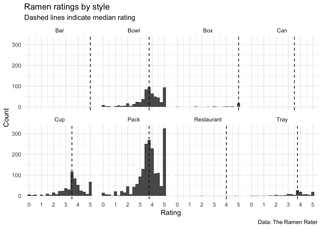
The plot above reveals that the majority of ramen comes in bowls, cups, or packs. Additionally, the distributions for those three styles appear pretty similar; they each have a median rating just above 3.50 – most ratings are clustered around there, but there appear to be many products with ratings of 5.0 (i.e. the ratings are bimodal).
Next, I’ll look at the number of products from each country. The plot below reveals the disparity in the ramen products from each country.
# Plot counts, ordered by country
ramen %>%
    drop_na(stars, style) %>%
    group_by(country) %>%
    count() %>%
    ggplot() +
    geom_bar(aes(x = fct_reorder(country, n), y = n),
             stat = "identity") +
    theme_minimal() +
    labs(title = "Number of ramen products by country",
         x = NULL,
         y = "Count") +
    coord_flip() +
    theme(axis.text.y = element_text(size = 6))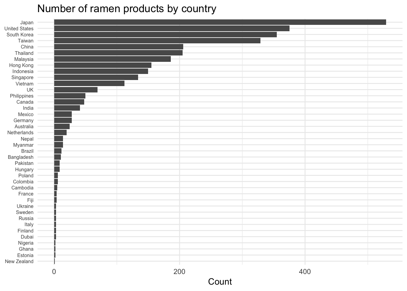
Which country has the best ramen?
I’m interested in looking at differences in ratings by country. The majority of countries only have a handful of products, so for clarity I’m going to focus on the top 15 most represented countries. From the plot above, this includes Japan to India (all of which have at least 40 ramen products).
# Compute and plot average ratings by country
# Data for top 15 countries (those with > 40 ramen products)
ramen %>%
    drop_na(style, stars) %>%
    filter(country %in% top15) %>%
    group_by(country) %>%
    summarise(N = n(),
              M = mean(stars),
              SD = sd(stars),
              SE = SD/sqrt(N),
              CI = SE*1.96) %>%
    ggplot(aes(x = fct_reorder(country, M), y = M)) +
    geom_hline(aes(yintercept = mean(ramen$stars, na.rm = TRUE)),
               linetype = "dashed") +
    geom_errorbar(aes(ymin = M - CI, ymax = M + CI, color = N),
                  width = .2, size = .75) +
    geom_point(aes(color = N), size = 4) +
    theme_minimal() +
    theme(axis.text.y = element_text()) +
    labs(title = "Average ramen rating",
         subtitle = "Countries with more than 40 ramen products",
         caption = "Note: Error bars indicate 95% CIs,
         Dashed line indicates overall mean",
         x = NULL,
         y = "Average rating") +
    scale_color_viridis_c(name = "Number of\nproducts") +
    scale_fill_viridis_c() +
    coord_flip()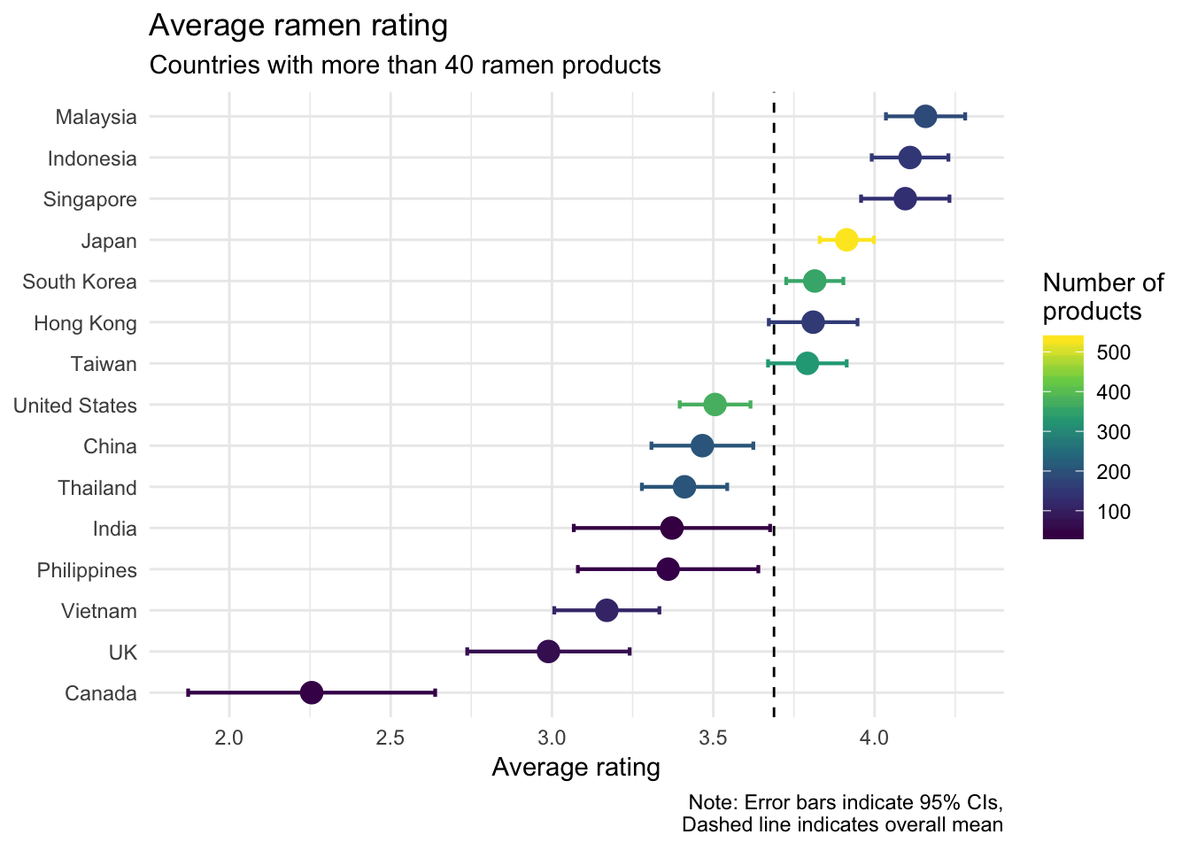
I’m proud to say that Malaysia has the highest average rating for its ramen. As shown in the plot (and indicated by one-sample t-tests I ran), Malaysia, Indonesia, Singapore, Japan, and South Korea all have ramen that is on average better than the overall mean (the average rating of all ramen in the dataset). Hong Kong and Taiwan are on average similar to the overall mean. The rest of the contries in the plot have ramen that is worse on average than the overall mean.
Ramen saturation
I’ve already looked at the number of ramen products produced by each country. Japan has the most products by far, but how does it compare to other countries on a per capita basis? I merged the dataset of ramen ratings with country population data (2017) from the World Bank. There will be variation across many demographic and economic factors, but a country’s population can serve as a crude stand-in for a pool of potential ramen eaters.
Perhaps larger countries represent a larger potential market, leading to more ramen products being produced. The following plot displays the relationship between a country’s population and the number of ramen products in that country. Due to countries like China and India with outlier populations, I used a log transformation for the population values.
# Plot ramen products by population
ramen %>%
    drop_na(style, stars) %>%
    group_by(country, label) %>%
    summarise(pop = max(population2017),
              N = n(),
              perCapita = N/pop) %>%
    ggplot(aes(x = pop, y = N)) +
    stat_smooth(method = "lm") +
    geom_point() +
    geom_label_repel(aes(label = label), size = 3) +
    scale_x_log10(labels = comma, minor_breaks = NULL) +
    theme_minimal() +
    labs(title = "Ramen products and population",
         x = "Population (log scale)",
         y = "Number of products",
         caption = "Data: The Ramen Rater\nand the World Bank")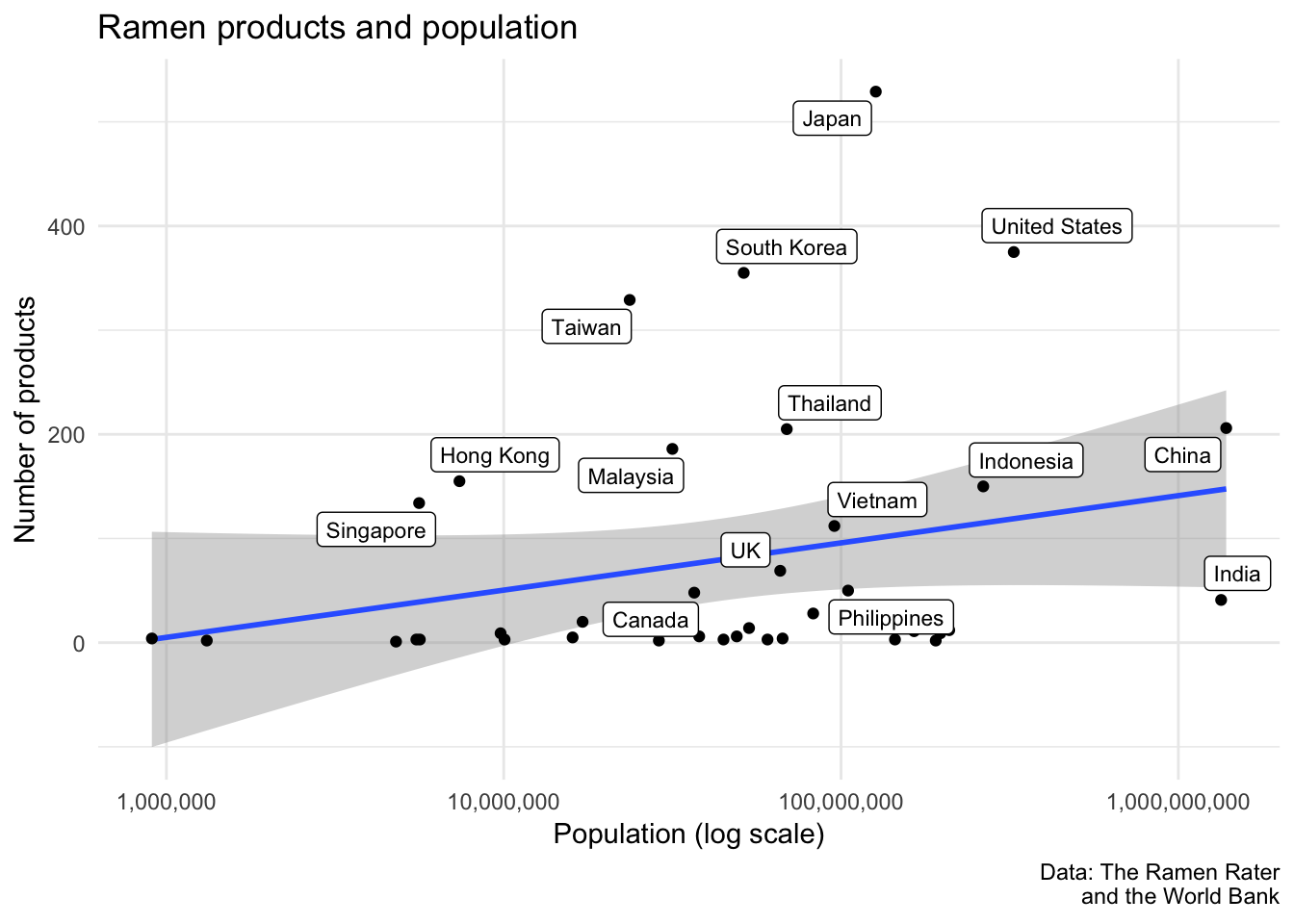
Despite the slightly positive trend, there’s no significant relationship between a country’s population and the number of products. This suggests that not all countries represent the types of markets that encourage the sale of ramen products. However, it would still be meaningful to identify the countries in which there is a high concentration of ramen products. Unfortunately, the log population scale above makes it difficult to pick out those countries.
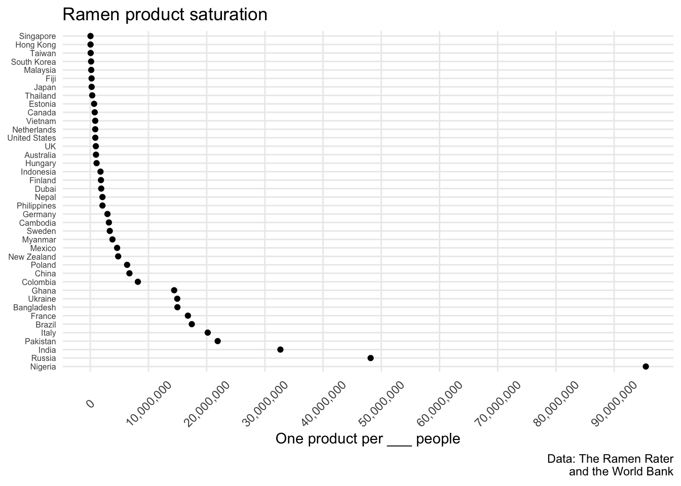
The following plot looks at the number of products per capita. Specifically, for each country, it visualizes the number of ramen products for a particular number of people in its population. Singapore has the highest ramen product saturation, with 1 product for every 41,882 people. Nigeria has the lowest product saturation, with 1 product for every 95 million people (Nigeria has over 190 million people, and only two ramen products).
# Plot ramen saturation = 1 ramen product for every _ people
ramen %>%
    drop_na(style, stars) %>%
    group_by(country, label) %>%
    summarise(pop = max(population2017),
              N = n(),
              perCapita = N/pop,
              oneIn = pop/N) %>%
    ggplot() +
    geom_point(aes(x = fct_reorder(country, perCapita), y = oneIn)) +
    theme_minimal() +
    labs(title = "Ramen product saturation",
         x = NULL,
         y = "One product per ___ people",
         caption = "Data: The Ramen Rater\nand the World Bank") +
    scale_y_continuous(labels = comma,
                       breaks = seq(0, 95000000, by = 10000000),
                       minor_breaks = NULL) +
    coord_flip() +
    theme(axis.text.y = element_text(size = 6),
          axis.text.x = element_text(angle = 45, vjust = .5))