Fantasy Football season in review (2017-2018)
This season, a friend invited me to join his family’s Fantasy Football league, which gave me a chance to dabble in analytics. Prior to this season, I’ve been more interested in American Football the band than the sport.
I know people who make fantasy football decisions for non-rational reasons (e.g. choosing players out of loyalty). On the other hand, I also know those who use their intimate knowledge of the sport to take into account relevant information a novice like me might overlook (e.g. how rainy weather affects the passing game, how rookies tend to perform in new teams).
My goal was to see if I could use analytics to compensate for my lack of football knowledge when making fantasy football decisions. Instead of relying on the Yahoo! league projections and personal affinities for players to make lineup decisions, I used the Fantasy Football Analytics R package to compute player projections based on a weighted average of different analysts, hopefully giving me better access to the wisdom of the crowd.
This led me to draft some players that my friends and family hate. But I’m a winner, and I trust statistics over emotional attachment, so I’ll go with Rob Gronkowski every time (except his bye-week).
Season overview
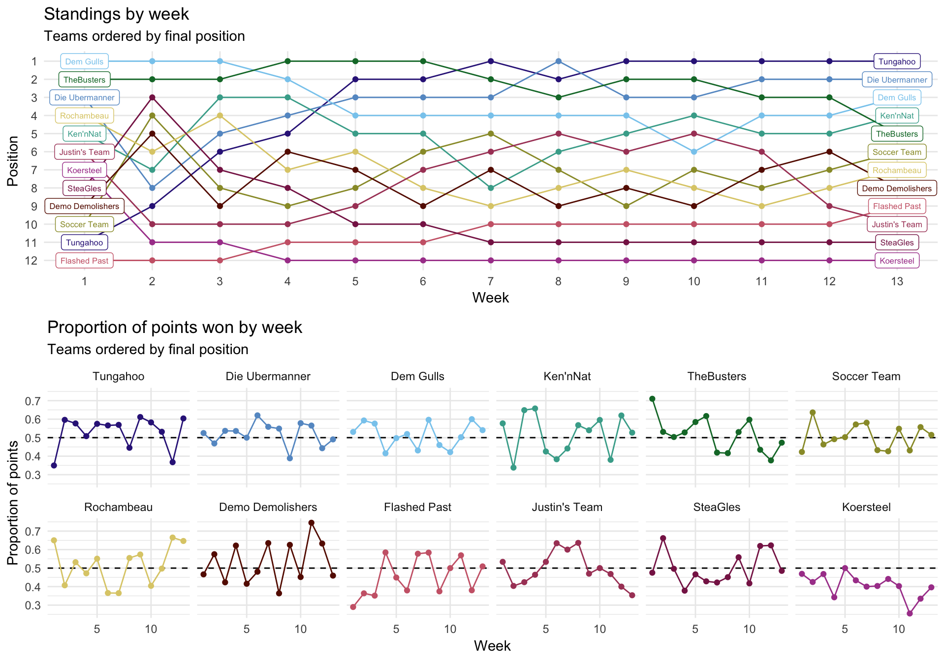
My team, Soccer Team, was average, finishing 6th out of 12 teams with a 7-6-0 record. The first graph shows how each team’s position changed during each week of the season. The win-loss-tie record ignores how big or small the margins of victory were, so a better metric of performance is the proportion of points won each game (a team wins if they get more points than their opponent – i.e. more than 50% of the points within a game). The second graph plots the proportion of points won by each team for each week of the season.
Actual vs. projected points, winning vs. losing
On average, more skilled managers will have better win-loss records because they’re better at identifying players who will yield more points each game. However, win-loss records are imperfect indicators of skill because they are also tied to the strength of one’s opponent.
Most leagues provide point projections for individual players, which serve as a baseline for performance. Your team is performing well if it meets or exceeds the projections from the league, and underperforming if it fails to meet the projections. The following graph plots the projected vs. actual total points for each game by each manager. The points above the dashed line indicate that the team beat its total projection for that week. The color of the points indicate the outcome of that game.
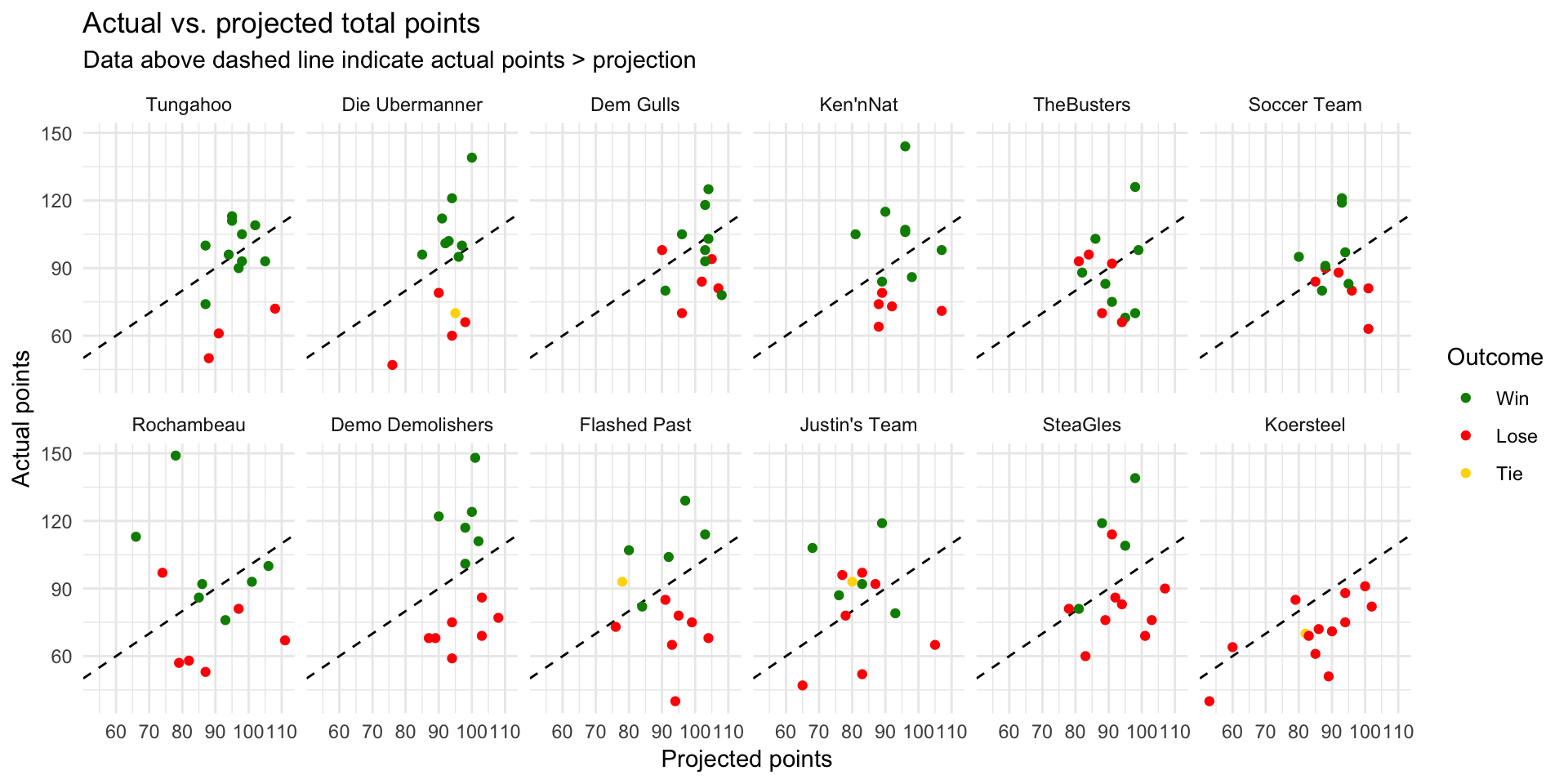
Generally, you are likelier to win if you beat your points projection. However, the outcome is also determined by your opponent. For example, you might have an exceptional day and beat your projection by 15 points, but your opponent might start out with a +20 point spread and still win despite falling short of their projection by 3 points.
Which managers were best at translating good performances (beating their projections) into wins? Matchups seemed pretty fair for a team like Demo Demolishers: they won every time they beat their projection, and lost every time they fell short of their projection. Tungahoo had pretty favorable circumstances (usually starting out with really high projections), racking up 4 wins even when underperforming. In contrast, TheBusters were pretty unlucky to record 3 losses even when beating their projections.
The following table displays each team’s win-loss percentage (ignoring ties) when it underperformed (actual points < projected points) or overperformed (meeting or exceeding its projection). Sort the table to see which teams had the best or worst win-loss records when under- vs. overperforming. TheBusters and Justin’s Team were pretty unlucky, only winning half of the matchups in which they overperformed. However, TheBusters also benefited from some good luck when underperforming, winning 70% of those games.
Winning percentage when over- vs. underperforming
Player projections
Since a manager’s role involves selecting players, let’s zoom in to analyzing how individual players performed. Think of a manager’s skill as their ability to choose players who will maximize points over what’s expected. This expectation is shaped by each player’s projected points going into a game, so we’ll measure skill using the difference between the actual and projected points. Using the difference in points also accounts for factors beyond a manager’s control like injuries.
The following graphs plot each team’s distribution of actual and projected points for each starting player (for all regular season games). The colored lines indicate the relationship between players’ actual and projected points. Lines steeper than the dashed lines indicate that on average, players’ actual points > projected points, resulting in regression coefficients > 1.
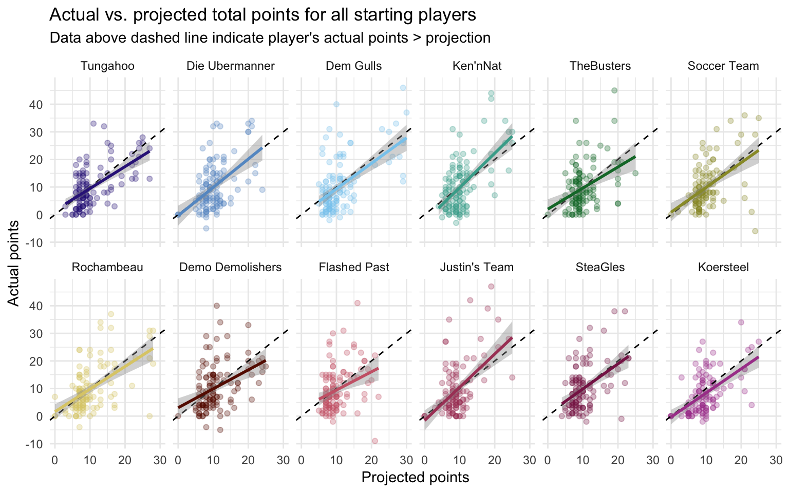
Most managers chose players who (on average) fell slightly short of their projected points, except for Ken’nNat (B = 1.24) and Justin’s Team (B = 1.20). This analysis shows that it’s pretty hard to beat the projections by identifying the right players to start, and few managers do so reliably. This is mainly because on average, most players fall short of their Yahoo! league projections. The ultimate question for a manager: Can we identify players who are likelier to beat their projections, or at least minimize how far they fall short of them?
Points by position
Players in some positions tend to do better than those in other positions. This is reflected in the projected points (e.g. top-tier QBs tend to get projections close to 20 points or more), but the higher the projection, the more likely a player is to fall short of it. Because of this, it’s worth asking: Are players in some positions more reliable than others in meeting their projections? The following graph plots the projected vs. actual points for all players in our league (both starters and non-starters) by position.
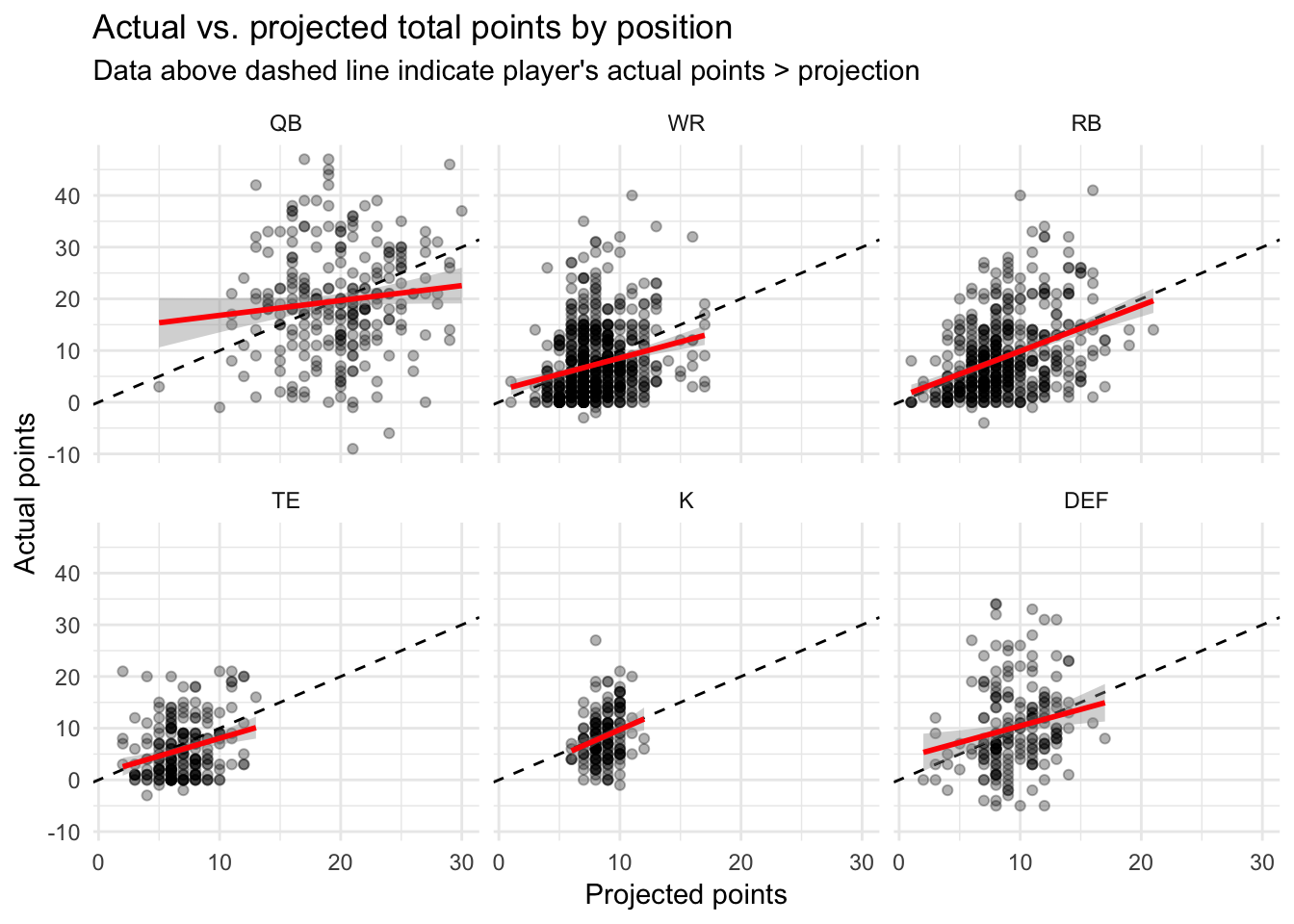
Running backs (RB) are the likeliest players to meet their projections: the regression coefficient capturing the relationships between their actual and projected points are B = .88, and this relationship is pretty strong (partial-R2 = .151). Kickers (K) have a similar relationship, B = 1.03, although this relationship is pretty noisy; partial-R2 = .059. Other positions tend to underperform their projected points. Quarterbacks (QB) have a particularly tenuous relationship with their projected points (B = .29, partial-R2 = .013), but choosing wide receivers (WR, B = .63, partial-R2 = .052), tight-ends (TE, B = .69, partial-R2 = .075), and defenses (DEF, B = .64, partial-R2 = .039) are also exercises in finding the rare players who won’t underperform.
Did players of differing positions perform differently across teams? The following table displays the ratio of actual to projected points for starters in different positions by team. Ratios > 1 mean that a team’s players in that position tended to outperform their projections. Sort the table by each position to see which team owned which position.
Ratio of actual to projected points by position and team
Sit-start decisions
It’s awful when a starting player fails to meet his projection. It’s even worse when you started him in place of another player who has a breakout game. In Week 10, I sat Dion Lewis (21 points) and started Alfred Morris (5 points) because of Ezekiel Elliot’s suspension. I dropped Alfred Morris the next week, and he then exploded for 20 points. It’ll take awhile for me to trust a Cowboy again.
The best managers should have a better than average ability to know which players to sit and start in each position. In theory, a manager might somehow choose the lineup (1 QB, 3 WRs, 2 RBs, 1 TE, 1 K, 1 DEF) that yields the optimum number of points such that switching any starter with a bench player would have led to fewer points. In reality, most teams could have scored better if they had made a few different sit-start decisions. The following graph shows each team’s sit-start efficiency: the point differential between the actual lineup and the optimal lineup, as well as the number of sit-start decisions a lineup was from the optimal lineup. Large values indicate that a manager could have done much better in a game by making different sit-start decisions.
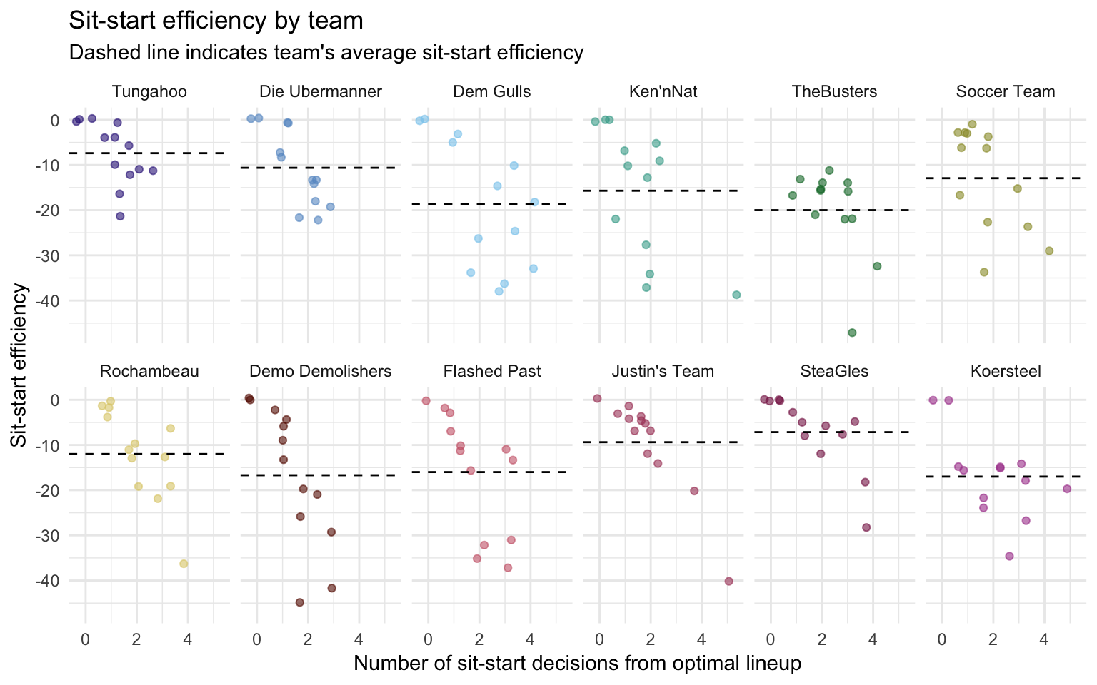
Optimal lineups (a maximum sit-start efficiency of 0) were achieved 20 times. SteaGles managed this the most times (4), which is some consolation since they finished in 11th place. SteaGles also had the best average efficiency of -7.15 points, implying they’re pretty good at team selection but perhaps got really unlucky with the players they drafted. TheBusters had the the worst average efficiency (-20 points), suggesting that of all teams, they really should not be trusting their current selection process. (This is my best attempt at statistically-informed trash talk).
How would the season have panned out if each team had made optimal sit-start decisions? Because these counterfactual questions depend on multiple factors, we’ll limit our hypothetical to each team making optimal sit-start decisions while their opponents’ lineups remain unchanged. The following table displays the counterfactual standings given optimal sit-start conditions. For comparison, the table below that shows the actual standings.
Counterfactual standings with maximum sit-start efficiency
Actual standings
With maximum sit-start efficiency, Demo Demolishers would have jumped from 8th to 4th place, while Ken’nNat would have dropped from 4th to 8th. Most other teams’ positions would not have changed all that much.
Conclusion
Fantasy Football is a delightfully weird world, but it successfully got me interested in a new sport. I love the weird hopes it can lead to: “I hate the Ravens, but I started their kicker so I hope the Steelers’ defense forces field goals at around 45 yards, because field goals from that distance are worth more points. But my opponent also started the Steelers defense, so I need the Ravens to score a lot, just not through Alex Collins, who is my opponent’s starting RB.” True story, that’s how I got eliminated in the playoffs.
It’s also led to my wife questioning my Pittsburgh credentials, since I’ve played around with a few Ravens and Patriots in my lineup. Rob Gronkowski was one of my top players, and I even started Joe Flacco one week. My wife was outraged to find out about that one.
My experiment in analytics didn’t yield the success I hoped. This is probably because selecting players in fantasy football is an inherently noisy endeavor. Call it sour grapes, but I maintain that another reason is that I lost David Johnson (1st overall pick) and Allen Robinson (my 4th round pick) to injury in Week 1, so I was constantly playing catch-up. I’m not ready to abandon this experiment yet, but it’ll have to wait for next year!