National battleground 2016
Election maps showing each state as a monolithic red or blue piece of the country aren’t very informative. Visualizing results by county reveals the voting patterns in some states to be pretty diverse – e.g., California’s coast went for Clinton while inland counties went for Trump; Texas starts to lean towards Clinton the further south you go; and most red states have at least one island of swing or blue-leaning counties.
In the interactive map below, you can view each county’s result, or the average margin of victory for each state. The map and dataset I’m working with consists of 3,108 counties. This excludes counties/districts from Alaska and Hawaii (I’ll explain why later).
Let’s play a game. Imagine that we put all those counties in a bucket. If I randomly drew one county from the bucket, would you guess that county voted for Trump or Clinton? (And relatedly, could you estimate the margin of victory?) What if you had some information about the county (e.g., that it’s in Pennsylvania)? Would that information affect your guess or estimate? In the following analyses, I’ll look at several variables that are relevant for guessing how a particular county voted.
Guessing (mostly) blind
How would a naïve person guess the winner of a particular county? In the absence of any information about the county, the best we can do is guess the winner was the candidate who won more counties. The left panel of the following figure displays how many counties each candidate won – Trump won way more counties than Clinton did!
The right panel of the figure plots the victory margins for the winning candidate in all counties. The mean victory margin is 31.99% in favor of Trump. Since the distribution is positively skewed, the median victory margin of 38.24% for Trump may be a better measure of the “prototypical” county.
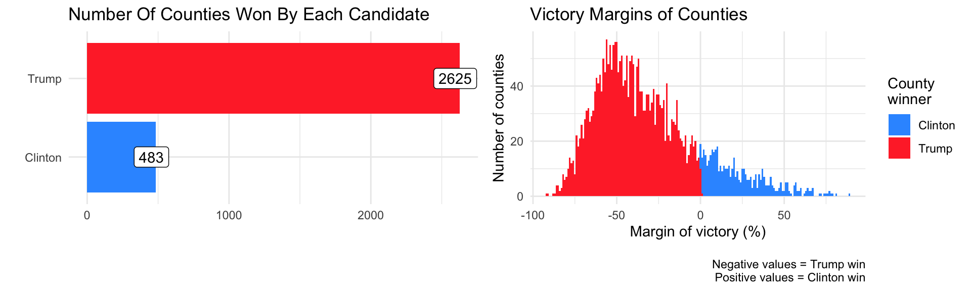
It seems that in the absence of any information, it’s safer to guess that a randomly drawn county voted for Trump. Additionally, it’s safe to guess that the victory margin of a randomly drawn county leans pretty heavily towards Trump. On the surface, this goes against the fact that Clinton won the popular vote (as I had previously written about).
Cities Vs. flyover country
Some good stuff has been written about the urban-rural voting divide in voting trends: cities and metropolitan areas tended to vote for Clinton, while sparsely populated counties (sometimes referred to as ‘flyover country’) tended to vote for Trump.
Urbanicity is a multifaceted construct, but we do know the number of people who voted in each county. This isn’t a perfect measure – higher voting rates could reflect demographic and geographic differences in voter enthusiasm – but on average, more urban counties tend to be more densely populated and will therefore have more voters.
If I told you the number of voters in a given county, how well could you guess whether it voted for Clinton or Trump? The following figure plots the relationship between total voters and victory margins in all counties.
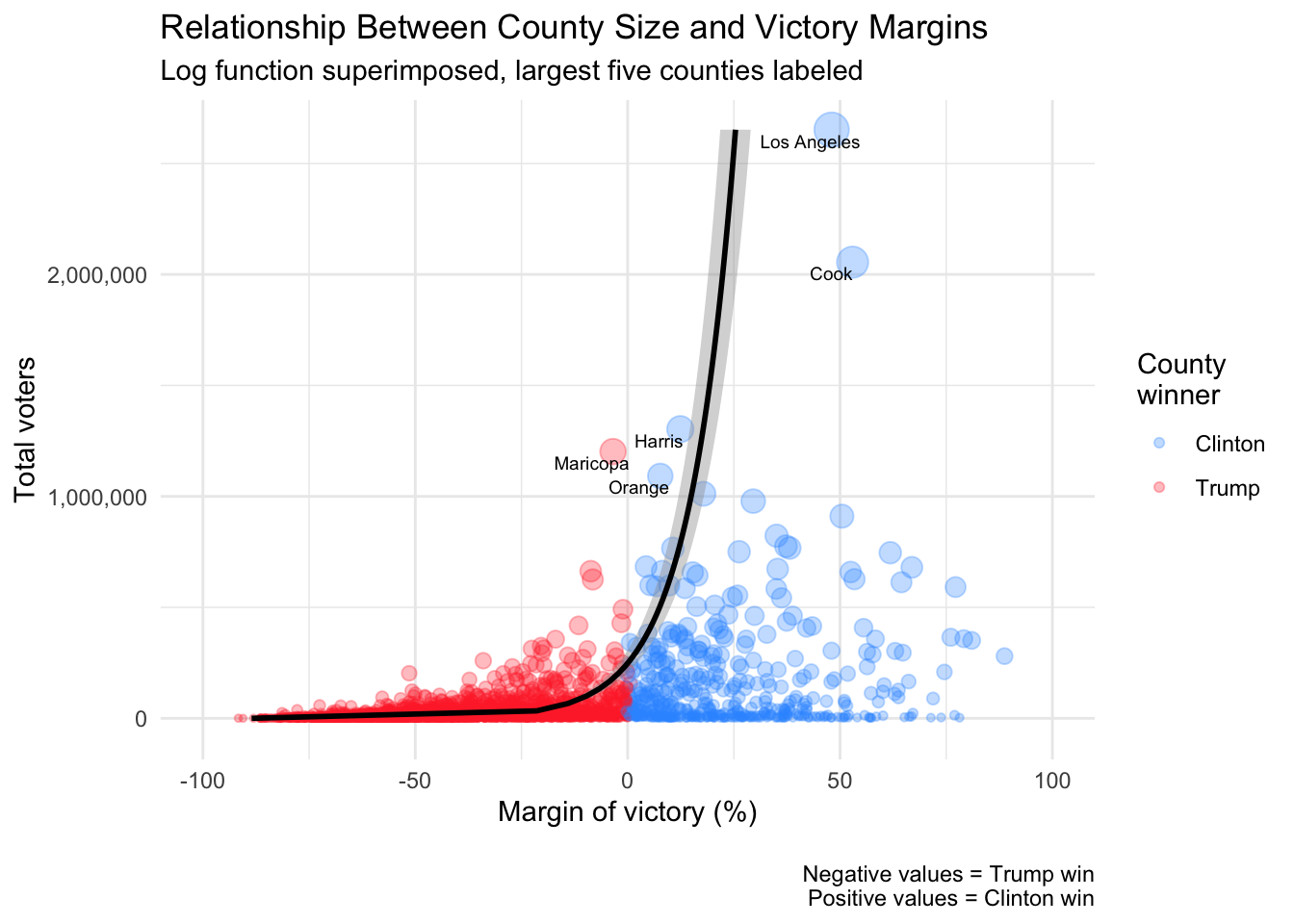
The counties that Clinton won tended to be much bigger (contributing to her popular vote victory margin, but perhaps not doing much for her electoral votes if the county is in a state that’s primarily supporting her already). Of the five counties with the most voters, four voted for Clinton (only Maricopa in Arizona voted for Trump).
I fit a log function to the plot (which fit better than a simple linear function – a log function also makes sense because there’s a natural ceiling to the vote-margin of each county) and found that county size explains 25.38% of the variance in victory margins. If there are at least 100,000 voters in a county (there are 284 such counties), the odds of that county voting for Clinton over Trump = 1.6, meaning the county is 1.6 times likelier to vote for Clinton than Trump. If there are at least 200,000 voters (there are 142 such counties), the odds are 3.3 in favor of Clinton. Thus, if I told you the size of a randomly drawn county, you could update your guess about who won it pretty well.
These United States
What if I drew a random county and told you the state it was from? Since some states leaned heavily towards a particular candidate, knowing the state should allow you to guess the outcome in that county. For example, Wyoming’s state-wide margin was 47.56% in favor of Trump, and only one of its 23 counties voted for Clinton. So if the county I drew came from Wyoming, you should bet money that it voted for Trump.
How diverse are voting patterns within each state? The following graph plots the distribution of county-level victory margins within each state. The states are ordered by State-wide margins from the most Trump-leaning (Wyoming) to the most Clinton-leaning (Washington DC, though it’s not a state).
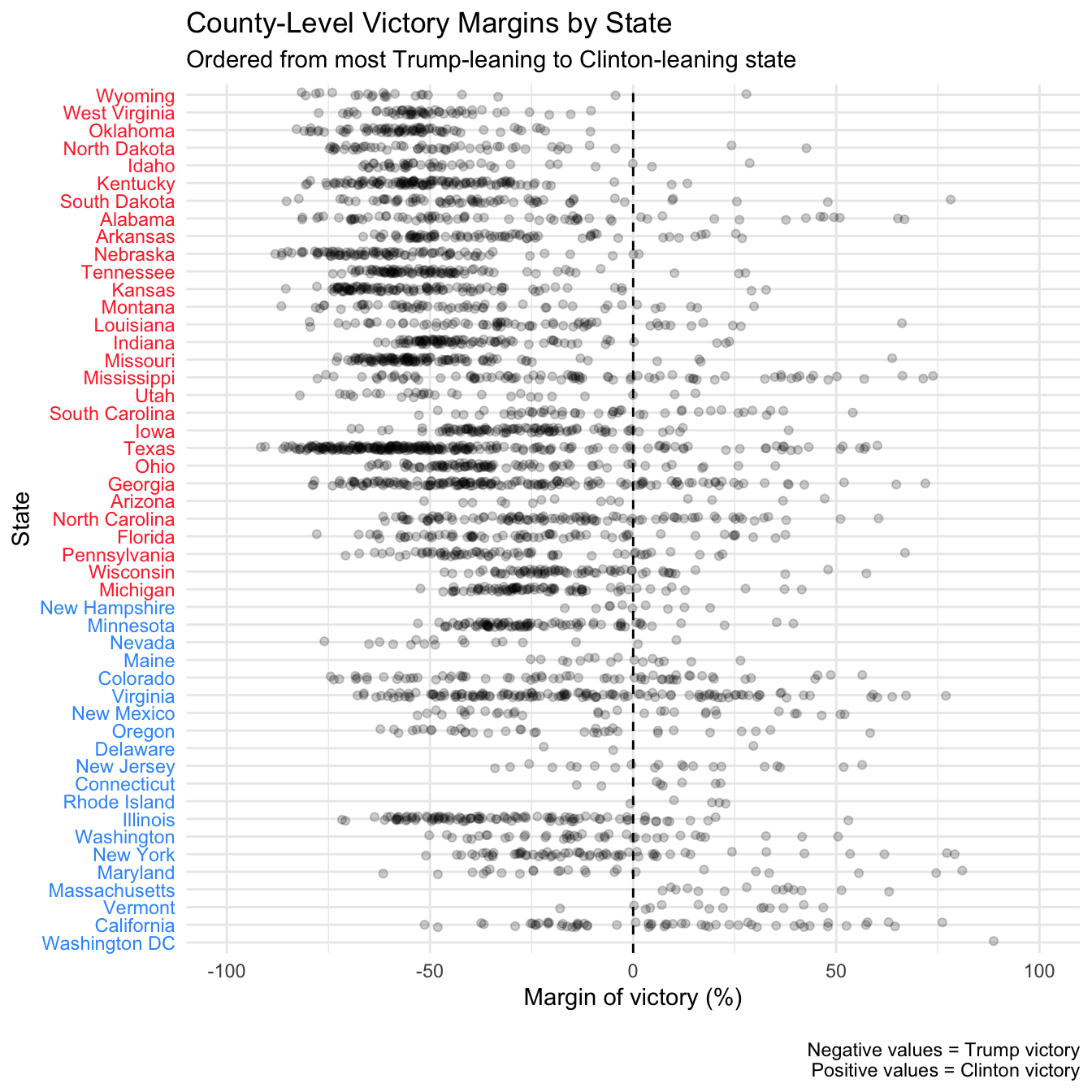
In the majority of states, counties are pretty diverse. Apart from the states with the largest margins for either candidate, most states contain significant numbers of counties that lean towards the opposite candidate. Even in Clinton-heavy California, Trump won the majority in 26 of 58 counties (though these counties tended to be much smaller than the ones won by Clinton).
Still, there are clear state-based voting trends, which can be helpful in our guessing game. The differences between states account for 31.43% of the variance in victory margins. So compared to knowing the size of a county, knowing the state it’s in seems slightly more informative when guessing the outcome in that county.
American Nations
Are there other categories (besides the states) that we can use to understand the variation between counties?
I’ve been fascinated by Colin Woodard’s American Nations for awhile now. According to Woodard, the United States of America is composed of distinct ethno-regional nations, each with distinct cultures and heritage. He argues that the regional differences (visible in voting patterns) are explained by the unique histories each nation has. I won’t analyze the distinct voting patterns of each nation here, as he’s already written some excellent analyses on that topic.
The states cut across the borders of these nations. To see this, select the American Nations’ borders in the interactive map above! You can also set the map to show vote margins by nation. To create this map, I made use of data Woodard shared, merged with my initial dataset. Note: I omitted Hawaii because it’s a nation that Woodard doesn’t discuss extensively, and Alaska because they don’t release results by county. My wife, who was born in Alaska, was rather upset about this.
Does it make more sense to organize counties by nation, or by state? We’re used to thinking of the states as meaningful political units in elections, but his book argues that the nations are a meaningful organizational scheme – if not an alternative, at least a complementary way to divide counties.
How diverse are voting patterns within each county? The following graph plots the distribution of county-level victory margins within each nation.
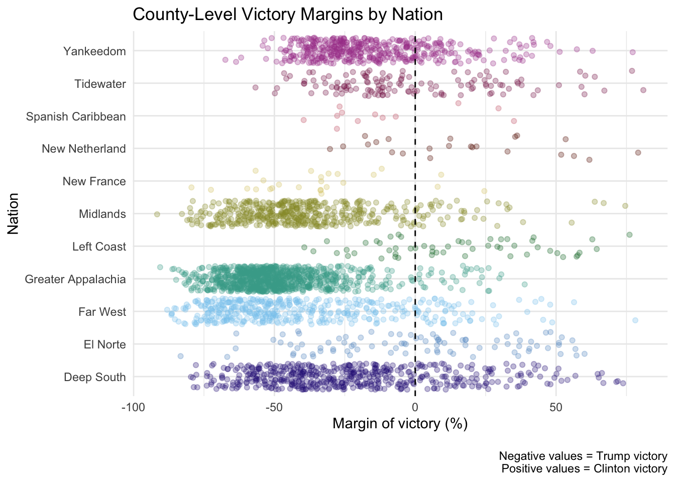
There appear to be clear nation-based voting trends, which can be helpful in our guessing game. How helpful is knowing a county’s nation compared to knowing its state? The differences between nations account for 30.56% of the variance in county-level victory margins. Knowing a county’s nation is roughly as informative as knowing the county’s state when trying to guess its outcome.
Winning the guessing game
It seems that all three predictors go some way in helping us improve our guesses about county-level outcomes. If you have information about all three predictors (i.e. you know the state and nation a particular county is in, along with its size), you can explain 52.7% of the variation in the county-level voting margin. However, there is significant overlap between predictors – some states tend to have larger counties than others, the states and nations literally overlap, etc. – so the predictors are likely explaining away much of the same variance.
To determine which predictor is most informative, we look at the unique variance each one accounts for in the county victory margins while “controlling for” the others (here’s a layman’s explanation for what it means to control for something). So here are the final results for our predictors:
| Rank | Predictor | Variance explained | Unique variance explained |
|---|---|---|---|
| 1 | American Nations | 30.56% | 9.63% |
| 2 | Number of voters in county | 25.38% | 9.58% |
| 3 | States | 31.43% | 7.57% |
Granted, the predictors don’t differ that much in how informative they are when guessing a county’s outcome, but it’s pretty cool that a lesser known predictor (the American Nations) is at least as helpful as more well-established predictors (like states and county size). This provides some empirical validation that the nations Woodard proposes are real entities (aside from the historical and demographic evidence he proposes). Or perhaps another way to think about it is that the states aren’t as concrete as we tend to think – the states are less informative about counties than the American Nations – a categorization scheme that doesn’t have electoral votes assigned to it.
This guessing game illustrates that given the right information, we can typically make pretty good guesses and outperform chance when predicting outcomes. It might also suggest different strategies candidates might take when campaigning.